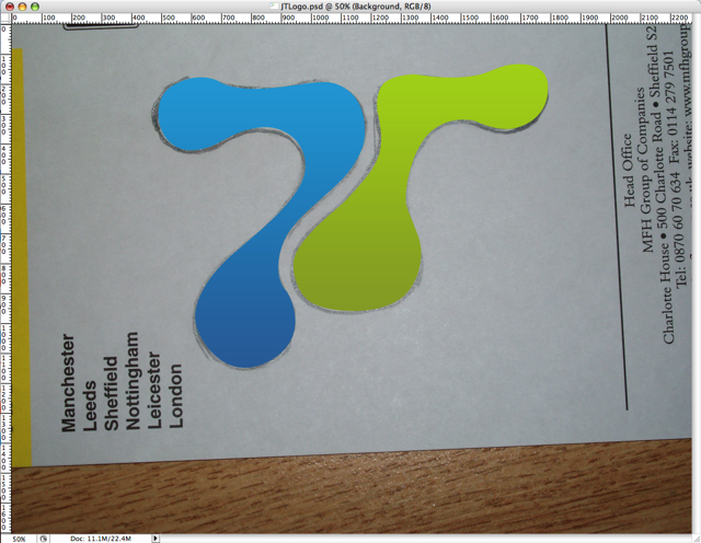
 As you can see from the new design, the blob is taking more of a centre stage. So how did I come up with the idea? and how did I make it.
Designing in general can seem complicated and daunting but with just a few photoshop techniques in your toolbox. You can create a logo for you in a couple of hours or less.
You start with a blank sheet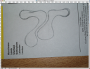
Like all good things its best to start with no computer, a soft pencil, rubber and blank sheet of paper will do. Start by just randomly sketching something and then start working that into a logo (say you initials for example) You can spend as long as you like making this drawing look something like how you want it, but it doesn’t have to be very neat.
Say Cheese
Next step take a photo of your design (or scan it) I tried drawing my logo free hand straight on the my fantastic Wacom Intuos3 tablet, but it never looked right. This way works best for those of us who aren’t 100% confident with the graphics tablet. 
Follow the Yellow Brick Road
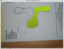 Now for the slightly more complicated bit, open up your photo in photoshop and start using the pen tool, to trace over your logo. You can find a fantastic tutorial on the pen tool over on PixelPerfect
 You can then continue and play with the path till its perfect (this is why you pencil drawing didn’t need to be perfect)Then fill the path with a gradient by creating a gradient layer and using the path to mask it. Repeat this process until all elements of your logo.
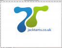
Add a bit of text and you have yourself a logo. Its not that difficult, really. The harder part is making your website match your logo.

 With all the talk of the new £400,00 London Olympic log, flying around and a building consensus of it being naff. I thought I would wade in and say its good and more importantly I like it.